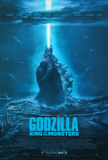
Genre Research: Godzilla: King of The Monsters (2019)
Camera Angles and Movements: In Godzilla: King of The Monsters, there are numerous Close Up and Extreme Close Up shots on the monsters in the film, showcasing the precise detail that was used to design the creatures. There are also wide angle and establishing shots used, post-attack, to show the mass chaos and destruction caused by the monsters’ battles. Finally, Low Angle shots are used, most frequently on the titular Godzilla, to emphasize the position of power and strength that he holds.
Mis-En-Scene: The costumes for the vast majority of plot-relevant characters consist of casual clothing, highlighting the fact that the film takes place in present-day. Some characters are costumed in more militarized clothing to fulfill their role in the film. The lighting is usually extremely reduced, with most of the film taking place at night or underground. This has the effect of promoting an air of gloominess and foreboding, which is prevalent in numerous ways throughout the film. Acting is used to convey the sense of awe and fear regarding Godzilla and the other monsters, again emphasizing their power. The setting is also accurately destroyed to similarly represent the power the monsters wield.
Sound: Diegetic sound is used for iconic sounds such as Godzilla’s roar and the other vocalizations made by other monsters throughout the film. This exposes the audience to the sensations that the characters in the film would be experiencing. There are also voiceovers of several key scenes, giving the viewer the impression that the speaker is looking back on the events.
Editing: There are several scenes where dialogue between characters is rapidly cut away from to show the action between the monsters. This is used to display the frantic nature of such scenes in the movie and show that there are many events occurring at once. There are also several instances of eyeline matches, where a character’s reaction is shown and the focus then shifts to what the character is reacting to, usually action of some variety.
Elements: In my research, my group identified that, of the Sci-Fi conventions, the most used in this film are Low Angle shots, Acting and Settings, Diegetic Sound, and Cutaways. Low Angle shots are frequently used to emphasize the power and destructive capacity in the film, as is the Acting and Setting in Mis-En-Scene. The Diegetic Sound is also common as it serves to help the viewer relate to the characters.
Appealing Elements: My group likes the use of low angle shots and cutaways. These are (relatively simple) camera movements and editing techniques that can be easily implemented in our film, which would effectively create the atmosphere of tension and suspense we are aiming for.
Unappealing Elements: The use of atmospheric storytelling through setting is not appealing to my group. It would be very difficult, if not impossible, to create a setting comparable to a blockbuster Sci-Fi film, and without high-level CGI skills, we could not technologically synthesize such an environment either.

Comments
Post a Comment